- Home
- Games
- Company
- Careers
- Community
- Roadmap
- Media
- Store Support
- Feedback
- Contact Us
- Warhammer 40K
- Home
- Community
- Hub
- Screen layout issues
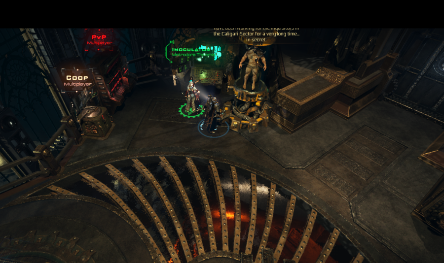
Hi there! I noticed that the overall screen overlay and the placement of different elements could get a small rework in the future.
1. The text boxes appearing above the NPC heads is awesome, but sometimes they are not visible because the game isn't taking the camera angle into consideration. E.g.: I rotated the camera before I talked with Thorn and I couldn't see what he was saying. The text got covered out.
2. I think the character model in the inventory screen could be placed into the middle of the screen (like in the character window) because currently if you have a bigger model like the crusader, some parts are hanging out from the picture. And the middle section is totally unused (but if you have already plans as a concept for this, than nevermind) :)
There was also a 3rd point but forgot about it already :D


Your Thoughts? Please login to place your opinion. Not a member yet? Register here and now!